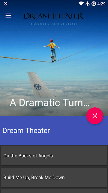
The last 2 weeks I've been working on the album details view along with learning how to do transitions between different views. As mentioned before I'm currently just focusing on the code portion so the actual UIs themselves are not final and still need a lot of work.
This is the current state of the album details view. Its using the CoordinaterLayout with a collapseable toolbar, so when you scroll up the album art will basically collapse into the toolbar at the top. I currently like how the album title moves while you scroll up and eventually becomes the title in the toolbar, but im not 100% sure if that is the direction i will go.
Below is a video that shows the transitions between selecting an album from the album grid and opening the album details. This was recorded on an old galaxy s3 running Lineage OS (7.1.2) so it appears the actual recording is a bit glitchy. The Image showing over half of the floating action button doesnt actually happen on the device.
Progress might seem slow but once a lot of the essential capabilities are written, they will be reusable on almost all the other views (IE artist detail view and genre detail view will be pretty similar to the album view, so it wont take long for me to add). Next up on my list is adding the 3 dot buttons / context menus on to the list / grid items.

