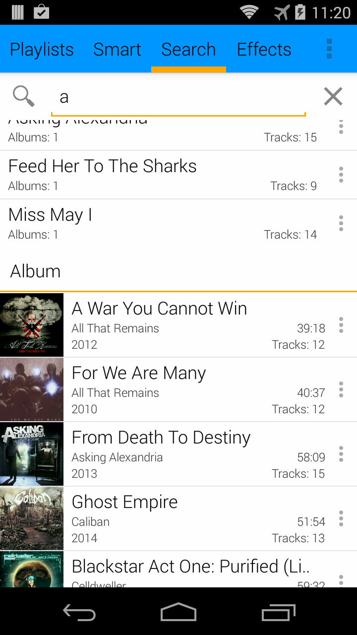
I have been hard at work on GMMP 2.0 over the last 2 and a half months and I finally am able to show off some of the changes so far. Nothing here is final by far and will most likely be a bit different when a beta is finally released (there is no ETA on the 2.0 beta and it definitely wont be out until after android L gets released)
Improved Holo UI
There are many users that currently enjoy the existing UI and I did not want to drastically change the UI without providing a way to fall back to the old UI. Material design looks fantastic but not everyone wants that. I personally like the flat navigation / swiping between views, so this will stay around as an option. I still wanted to give the holo UI a facelift so most of the layouts have been tweaked (to follow the UI guidelines) along with a bunch of new additions.
New Font
Roboto Light is now the default font (Roboto Bold happens to be used for the now playing metadata entries in this screenshot, but the rest is Roboto Light)
Overflow Menu
The long press context menu has been replaced with an overflow button
Multiple Selection
Long pressing a list item will now enable action mode (multiple selection). Play, Play Next, Enqueue, Add To Playlist, and Delete are the available actions for the majority of the views.
Improved Image Loading
In GMMP 1.6.x, all of the image loading was custom written because years ago when development started, there were really no libraries out there that handled image loading well. GMMP 2.0 uses Glide for all image loading. The difference is very noticeable. Scrolling is smooth and images load much faster.
Background Blurring
As an alternative to the album art background option, there is also an option to blur the background. I have been wanting to do this for a long time and was finally able to find an efficient way to do it.
Say goodbye to skins and say hello to the Theme Builder
Skins have been a huge pain to maintain. In the past, most changes to the UI also required every single skin to be updated. Each skin consisted of hundreds of layout and images, so even just creating a new holo skin with a different color was a lot of effort. Because of this, I have decided to take a new approach to customizing the UI. GMMP 2.0 will ship with a new Theme Builder to dynamically create the user interface.
Right now the builder has a few options but it will be expanded upon (some options may not make the final cut as well):
Note: Text color currently is linked to the base theme.
I know many users will not want to have to deal with all this so all these settings will be wrapped up into templates that can be used to build the UI quickly.
GMMP 2.0 is still very much a work in progress, but it is shaping up to be a huge improvement over 1.6.x
Right now the builder has a few options but it will be expanded upon (some options may not make the final cut as well):
- Base Theme: Holo Dark/Light, Holo Dark/Light with Colored Actionbar, and Material (not implemented yet)
- Navigation Style: View Pager (GMMP 1.x style) or Sliding Menu
- Primary Accent Color
- ActionBar Color (only works with the Colored ActionBar base themes)
- Background Color
Note: Text color currently is linked to the base theme.
I know many users will not want to have to deal with all this so all these settings will be wrapped up into templates that can be used to build the UI quickly.
GMMP 2.0 is still very much a work in progress, but it is shaping up to be a huge improvement over 1.6.x


